
CONTACT US
Table of Contents
Introduction
Welcome to the Theme Guide section for the Ironclad Restoration Marketing WordPress Theme using the Elementor Page Builder.
Getting Started
In this Theme Guide we’ll go over how to make changes/updates using Elementor to the website theme’s Site Settings, Theme Builder, Saved Templates, Global Widgets and Pages.
Site Settings
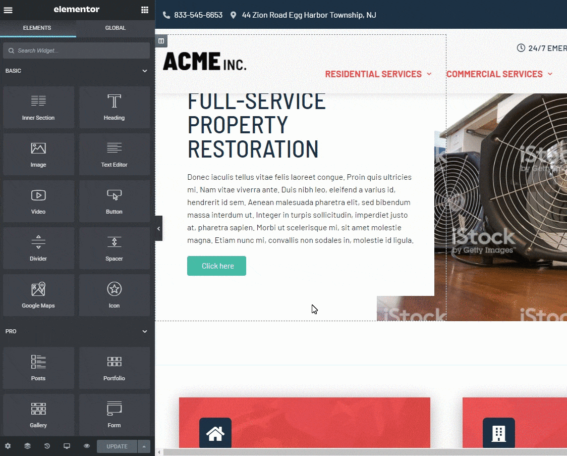
How do I access Elementor Site Settings?
Simply “Edit with Elementor” any page or post, click the hamburger menu icon in the upper left corner of the Elementor Widget Panel, and click on Site Settings. Here you have options to control the Design System which consists of Global Colors and Global Fonts, Theme Builder which consists of Typography, Buttons, Images, and Form Fields settings, and User Preferences, which consists of Site Identity, Background, Layout, Lightbox, and Custom CSS settings.
Design System
Set predefined global colors (Primary, Secondary, Text, and Accent colors), inline custom colors, or create new global colors for use across your site. See Global Colors for full details. Set and edit predefined global typography styles (Primary, Secondary, Text, and Accent) or create new global text styles for use across your site.
Global Colors
Here is where you can control the colors that are used throughout the entire theme. There’s a list of preset colors that will need to be updated to match the client’s specific style and branding.
Color Presets:
- Primary
- Secondary
- Tertiary
- Text
- Accent
- Dark BG
- Light BG
- White
- Black

These preset colors are also already applied to various elements/widgets that make up the theme making theme wide styling a quick process. New colors can be added but try to keep it minimal. When adding a new shade of an existing color, use a naming convention such as Primary-D-20 indicating the primary color shade dark, at 20%.
Global Fonts
Here you can set up the Global Fonts for the theme. There will be four preset styles already setup. You’ll just need to set the font family and disregard all the other properties. We’ll control the sizing, line height and weights through the Typography section under Theme Style.
Font Style Presets:
- Primary
- Secondary
- Text
- Accent
Theme Styles
Theme Style settings are global settings that allow you to set default styling options for various elements, such as Backgrounds, Headings, Buttons, Images, and Form Fields. These settings override the theme styling settings and takes its place, allowing you to use Elementor to set styles for elements not built by Elementor. By default, this will apply styles only to non-Elementor elements, for example, WooCommerce checkout fields, Contact Form 7 labels, 3rd-party headings and much more. If you prefer, you can force these Theme Style settings to also apply to Elementor-built elements as well.
Site Identity
Control your website’s identity, including its Site Name, Site Description, Logo, and Favicon right from Elementor’s Site Settings. Also, you can add an alternate logo under the Client Options > General Information section.
Theme Builder
Theme Builder settings are global settings that allow you to set default styling options for various HTML elements, such as Backgrounds, Headings, Buttons, Images, and Form Fields. They are not Elementor-specific, but are as general as possible. This is the baseline setting for the site, that comes into play only as a fallback, if no specific element definitions were set.
What is the Theme Builder in Elementor?
Elementor’s Theme Builder lets you customize every fundamental part of your WordPress site without coding including your Header, Footer, Global Pages and Posts, Global Archives and WooCommerce Products and Product Archives.
The Theme Builder provides a visual overview of the site elements of your site, helping to guide you through each of the site parts you need to create in order to achieve a complete website.
Using the Theme Builder, you can add new site parts (e.g. add a new Header), edit existing site parts, or delete site parts. Existing site parts include a visual indicator to inform you if a condition is applied to that site part. For example, a Global Post site part template may have a condition to only show for a particular category. A green indicator will let you see at a glance that this site part has a condition. A gray indicator is an indication that a site part has no condition set.
How To Access The Theme Builder
There are several ways to access the Theme Builder. Choose whichever is most convenient for you.
METHOD ONE: Go to Elementor > Theme Builder from the WordPress admin menu.
METHOD TWO: From within any page or post’s Elementor Editor screen, click the hamburger menu in the upper left corner of the Widget Panel, then select Theme Builder in the Settings tab.
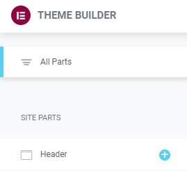
Theme Builder Main Dashboard
Your existing Site Parts will be shown, if any have been built. Thumbnails for each site part will be auto-generated for you.
Note: Any featured image assigned to a site part will be used as the site part’s screenshot. This enables you to use a thumbnail of your choice, rather than an auto-generated thumbnail, if you prefer.
Add A New Site Part
Or you can add a new Site Part by importing a template.
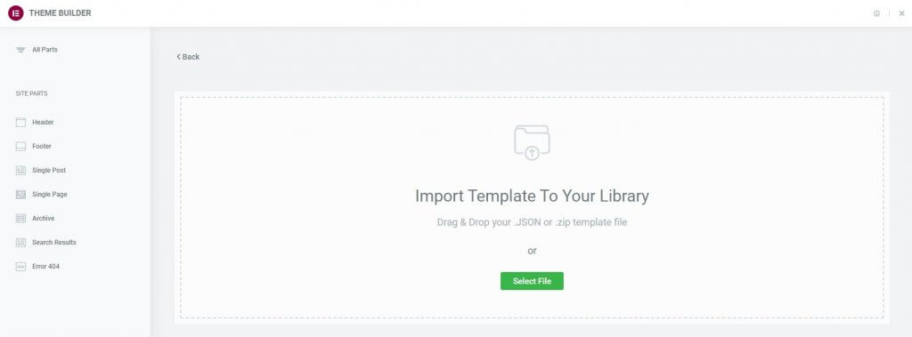
- Click the Import icon in the upper right of the Theme Builder.
- Drag and drop or select a .JSON or .zip file that contains the template you wish to import.
- The template will now be added to your Site Parts dashboard.
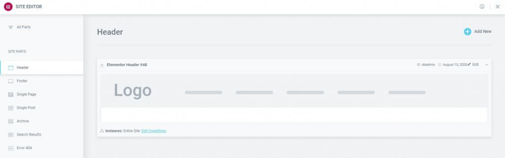
Edit An Existing Site Part’s Design
- To edit an existing Site Part, click the Site Part’s label in the sidebar. This will open the site part’s details dashboard.
- Click the Edit link in the upper right corner of the site part you wish to edit. This will open the Elementor editor for that site part.
Edit An Existing Site Part’s Conditions
- Click the Edit Conditions link in the bottom left corner of the site part you wish to edit. This will directly open the Display Conditions editor for that site part.
Note: The Dot Display in the upper left corner of the Site Part indicates which site parts are live (has Display Conditions assigned to it), and which are merely drafts (no Display Conditions have been assigned). A Green Dot indicates a live site part, while a Gray Dot indicates a draft site part.
Note: The Instances label in the lower left corner of the Site Part displays the specific instances in which this template is being used on the site.
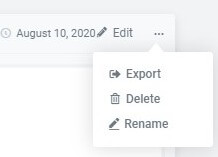
Export A Site Part
- Click the Three Horizontal Dots in the upper right of the site part you wish to export.
- Choose Export to open a Save dialog which will save a .json file to your computer.
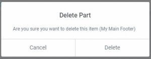
Delete A Site Part
- Click the Three Horizontal Dots in the upper right of the site part you wish to delete.
- Choose Delete which will open a Delete Part confirmation dialog box.
- Click Cancel if you change your mind and decide you don’t want to delete the site part, or click Delete to confirm that you do wish to delete this site part.
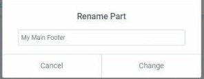
Rename A Site Part
- Click the Three Horizontal Dots in the upper right of the site part you wish to rename.
- Choose Rename which will open a Rename Part dialog box.
- Enter the new name and click Change to complete the rename process, or click Cancel if you change your mind and decide you don’t want to rename this site part.
Saved Templates
Our Theme comes with pre-made templates and sections that are used throughout the website.
- City Page Template
- Services Parent
- General Service Page - 1
- Header
- Page - One Column
- Page - Two Column
- Contact Form - Simple
- CTA Strip - 2 Col
- Interior Banner
- Footer Global
- Blog Archive - Author
- Blog Archive - Tags
- Blog Archive - Category
- Blog Archive - Default
- Blog Archive - General
Global Widgets
A Global Widget gives you full control over a specific widget that is displayed in multiple places on your site. Editing it in one place will instantly update the rest.
Emergency Disaster Restoration Specialists
Call Us Now for Immediate Assistance, 24/7/365
100% Satisfaction
Guaranteed
Friendly
Technicians
Locally Owned
& Operated
24/7
Support
Copyright © 2022 ITD Restoration All rights reserved.
Website By: Ironclad Restoration Marketing